ShopDreamUp AI ArtDreamUp
Deviation Actions
![[ai adopt] cloud wolf](https://images-wixmp-ed30a86b8c4ca887773594c2.wixmp.com/f/ddc18696-4f6c-45cb-9f33-d86c938029f4/dgrvwgf-53f2fb8e-b12f-494f-ad54-c21b79d1240b.jpg/v1/fill/w_350,h_350,q_70,strp/_ai_adopt__cloud_wolf_by_1dollaradopts_dgrvwgf-350t.jpg?token=eyJ0eXAiOiJKV1QiLCJhbGciOiJIUzI1NiJ9.eyJzdWIiOiJ1cm46YXBwOjdlMGQxODg5ODIyNjQzNzNhNWYwZDQxNWVhMGQyNmUwIiwiaXNzIjoidXJuOmFwcDo3ZTBkMTg4OTgyMjY0MzczYTVmMGQ0MTVlYTBkMjZlMCIsIm9iaiI6W1t7ImhlaWdodCI6Ijw9MTAyNCIsInBhdGgiOiJcL2ZcL2RkYzE4Njk2LTRmNmMtNDVjYi05ZjMzLWQ4NmM5MzgwMjlmNFwvZGdydndnZi01M2YyZmI4ZS1iMTJmLTQ5NGYtYWQ1NC1jMjFiNzlkMTI0MGIuanBnIiwid2lkdGgiOiI8PTEwMjQifV1dLCJhdWQiOlsidXJuOnNlcnZpY2U6aW1hZ2Uub3BlcmF0aW9ucyJdfQ.HGVS65W1BXzL9my-s9ik4APXaruQHkXSKYxoWc2JMcA)


![Wow [low poly]](https://images-wixmp-ed30a86b8c4ca887773594c2.wixmp.com/f/67acd788-eb6a-45e2-b2de-21113adcf7dd/d9kioyo-bae8a395-328a-4f08-be69-bef3dc0292d3.png/v1/crop/w_184,h_184,x_12,y_0,scl_0.1796875,q_70,strp/wow__low_poly__by_agraffkowa_d9kioyo-92s-2x.jpg?token=eyJ0eXAiOiJKV1QiLCJhbGciOiJIUzI1NiJ9.eyJzdWIiOiJ1cm46YXBwOjdlMGQxODg5ODIyNjQzNzNhNWYwZDQxNWVhMGQyNmUwIiwiaXNzIjoidXJuOmFwcDo3ZTBkMTg4OTgyMjY0MzczYTVmMGQ0MTVlYTBkMjZlMCIsIm9iaiI6W1t7ImhlaWdodCI6Ijw9ODIwIiwicGF0aCI6IlwvZlwvNjdhY2Q3ODgtZWI2YS00NWUyLWIyZGUtMjExMTNhZGNmN2RkXC9kOWtpb3lvLWJhZThhMzk1LTMyOGEtNGYwOC1iZTY5LWJlZjNkYzAyOTJkMy5wbmciLCJ3aWR0aCI6Ijw9MTAyNCJ9XV0sImF1ZCI6WyJ1cm46c2VydmljZTppbWFnZS5vcGVyYXRpb25zIl19.lv3ucvY5oOTNNqBDECXZY8cHrnP2AQzJAEcNvfX9ysI)
![Wow [low poly]](https://images-wixmp-ed30a86b8c4ca887773594c2.wixmp.com/f/67acd788-eb6a-45e2-b2de-21113adcf7dd/d9kioyo-bae8a395-328a-4f08-be69-bef3dc0292d3.png/v1/crop/w_92,h_92,x_6,y_0,scl_0.08984375,q_70,strp/wow__low_poly__by_agraffkowa_d9kioyo-92s.jpg?token=eyJ0eXAiOiJKV1QiLCJhbGciOiJIUzI1NiJ9.eyJzdWIiOiJ1cm46YXBwOjdlMGQxODg5ODIyNjQzNzNhNWYwZDQxNWVhMGQyNmUwIiwiaXNzIjoidXJuOmFwcDo3ZTBkMTg4OTgyMjY0MzczYTVmMGQ0MTVlYTBkMjZlMCIsIm9iaiI6W1t7ImhlaWdodCI6Ijw9ODIwIiwicGF0aCI6IlwvZlwvNjdhY2Q3ODgtZWI2YS00NWUyLWIyZGUtMjExMTNhZGNmN2RkXC9kOWtpb3lvLWJhZThhMzk1LTMyOGEtNGYwOC1iZTY5LWJlZjNkYzAyOTJkMy5wbmciLCJ3aWR0aCI6Ijw9MTAyNCJ9XV0sImF1ZCI6WyJ1cm46c2VydmljZTppbWFnZS5vcGVyYXRpb25zIl19.lv3ucvY5oOTNNqBDECXZY8cHrnP2AQzJAEcNvfX9ysI)


Description
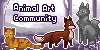
TALLY - The nickname of a 3 year old pug that sleeps all day, barks at the B&Q advert and has ventured into Polygon Art life drawings in her spare time. She has a penchant for banana and carrots, and warm laps to fold up next to, before evolving into her final form - a potato.

What are your thoughts on this piece?
Would you like to see more of this style?
What do you like most about this?
Is there any thing that could be improved?
What part of Deviant Art brought you here?
What are your thoughts on this piece?
Would you like to see more of this style?
What do you like most about this?
Is there any thing that could be improved?
What part of Deviant Art brought you here?
Image size
2976x1672px 670.52 KB
Comments9
Join the community to add your comment. Already a deviant? Log In
Hi! This a really nice piece of geometric art! You did a really good job with proportions and coloring. However, there are always improvements that you can make. One of the biggest one, I must say, is your choice of subject. Search up geometric art of animals on google; you will get a lot of samples. If you look carefully, the animals chosen are bright colored animal. By making "geometric" art, you lose part of the realism, and the details. However, by adding contrast to their colors, the viewer will at least be able to recognize parts of the picture. However, in your case, you did not use much contrast. For example, I realize that the black parts on top are ears; however, I see almost no detail; for example, I do not know how they are folded, whether it's facing up, etc. Additionally, the details around the nose is also very hard to discern. Another problem is that you chose to do the entire body. If you look online, most people will focus mainly on the head. The head is considered the most important part of the body, and artists generally try to highlight it; by making the only part shown the head, they are able to incorporate much more detail into the important part. If the DO choose to draw the entire body, it is preferable to have the creature in a standing position. This is, again, important for contrast. For example, in your picture, the legs next to the body. when you make it into geometric art form, it becomes difficult to tell the leg apart from the body. So, in general, you did a really good job, though the subject may have not been the best. However, lets say that you did want to work with this; how could you improve it? One thing I noticed was the lack of claws; that would have helped greatly in terms of distinguishing leg from body. Another idea is to NOT make the colors realistic. For geometric art, you see it moderately often. Artists opt for more vibrant and colorful color choices, because it 1) allows for more contrast, and 2) just makes the picture more energetic. You might choose to do shades of orange instead, for example. Just some food for thought. Overall, you did a good job, and I can't wait to see what you do next!